
Case studies / Website design
Three pages, because the work does the selling.
A photography led website for Maker Construction, Nashville
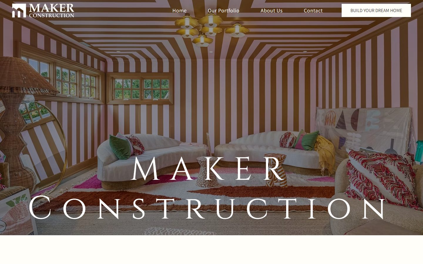
Maker Construction and Development is a family run builder in Nashville working on luxury renovations and ground up custom homes, with decades of hands on experience behind it. JBowman Creative designed and built makertn.com as the counterweight to the sprawling builder site: three pages, the finished work shown large, and a way to start a conversation on every screen.
- Hands on experience
- Decades
- Client promises
- 5
- Portfolio photographs
- 12
- Pages, on purpose
- 3
The challenge
Maker's advantage is what the finished rooms look like. Panelled libraries, custom millwork, the kind of interior a homeowner sees once and remembers. A long site full of service pages and blog posts would have buried the one thing that wins the job.
The risk in going lean is that a small site can read as a small company. The build had to feel considered rather than unfinished, and it had to give a homeowner a way to make contact from wherever they happened to stop scrolling.
What we built
A photography led build. The hero is a full bleed interior with the company name over it, the portfolio is a gallery rather than a list of services, and the contact form repeats at the foot of every page so the conversation is always one scroll away.
- A full bleed hero using Maker's own interior photography, with the name and a single call to action over it
- A portfolio page that is purely the work, twelve photographs with no copy competing with them
- An About page carrying the five things Maker wants a homeowner to know, from craftsmanship to local code knowledge
- The same contact form at the foot of all three pages, so an inquiry never depends on finding a contact page
- Address, phone, and email in the footer of every page, because a Nashville homeowner often just calls
- A responsive build that keeps the photography full width on a phone
Built for search. The homepage carries a written meta description and a title naming the market it wants, custom Nashville home builder, and the site ships with canonical tags and structured data. The build is deliberately small, so the job it does in search is to confirm and convert the people who already have the name, rather than to compete on page volume.
The results
- Live at makertn.com
- A written meta description and a market naming title tag on the homepage
- Canonical tag and two structured data blocks in place, and the build renders responsively on a phone
Questions about the Maker Construction project
What did JBowman Creative build for Maker Construction?
A three page, photography led site: a full bleed hero on the homepage, a portfolio that is purely the finished work, and an About page carrying the five things Maker wants a homeowner to know.
Does a builder need a large website?
It depends on what wins the job. A builder whose advantage is the finished room is better served by a small site that shows the work large and asks for the conversation on every screen. A builder selling a long process, or working across several markets, needs the pages to explain it.
How do you decide how big a builder site should be?
By what wins the job. If it is photography, the site gets out of the way. If it is process, track record, or a set of neighborhoods, each of those earns a page. We scope that in the first conversation rather than selling a page count.
Want a website that works this hard?
JBowman Creative designs and builds custom websites in Nashville with the SEO foundations built in, then grows them with SEO, Google Ads, video, and social from one team. See more of the work on the website design page.
Talk to us about your website Next case study: R Squared Design + Build